March 7, 2012
Get Responsive
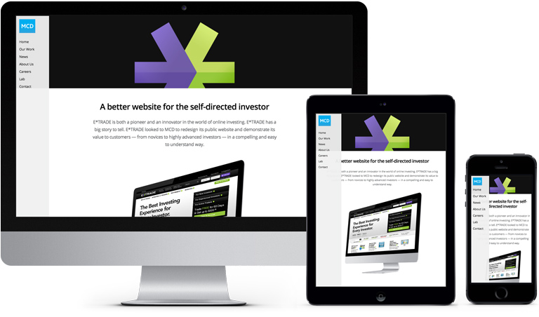
Smartphones. Tablets. Internet-enabled refrigerators. As we strive to meet the needs of our clients’ always on, connected audiences, we’re constantly being challenged to design for a wide variety of screen sizes and interface models.
MCD Partners Responsive Web DesignAs we move further into the multi-device era, it will be nearly impossible to design and maintain custom experiences for each.
One tool to make sense of this complexity is responsive web design, an approach in which a web page and its content scales and adapts to the screen size of the device it’s viewed on – thereby creating customized experiences for each device type (tablets, smartphones, etc.) while eliminating the need for designing and maintaining multiple websites. Introduced in 2010, responsive design is still in its infancy, but its simplicity and efficiency has rapidly been embraced as a new standard.
"It is the elegance of the approach that excited me," says Tom Simpson, Director of User Experience for MCD, "Responsive design finally gives companies the ability to publish once and have it appear properly for any device. The full website experience is available for all devices, instead of reducing the feature set of the mobile site to the bare minimum."
At MCD, we've had great results putting content sites, like this one, into a responsive framework. The trick of it becomes anticipating the right content hierarchy based on the context. We’ve been solving this problem by including mobile use-cases into our thinking from the outset of a project, even if a "mobile site" isn't explicitly stated as a requirement for the project. It is just becoming a natural part of the way we think about building sites.
A responsive website can be created with the proper blend of JavaScript and CSS allowing a site to be elastic – all part of our development toolkit. In order to make a design that works on a whole variety of screens sizes we need images and text that scale, margins that resize proportionally, items that wrap and reformat and even in some cases disappear. As the design shifts depending on the orientation of the selected device, one thing remains, the content is easy and pleasurable to consume and is appropriate for the kind of screen it’s being consumed on.
We're currently working on a variety of responsive design projects for several of our clients and have a number more on deck. This site you are looking at (MCD Partners) is built to be responsive. Change the window size and see!
Check out our list of clients or get in touch about a project.